The Hole in the Menu: On Missing Buttons and Digital Grief
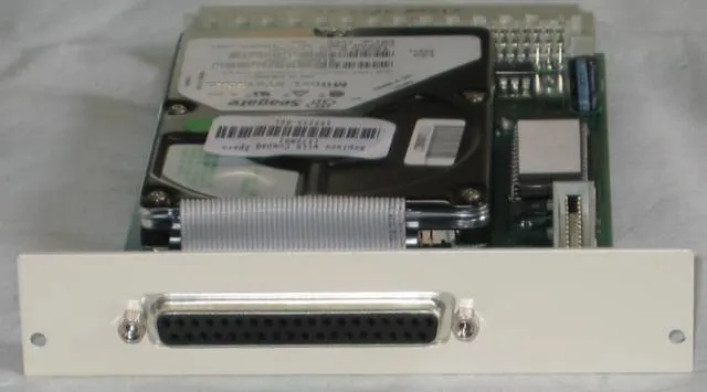
Photo: Chris Whytehead, CC BY-SA 3.0, via Wikimedia Commons
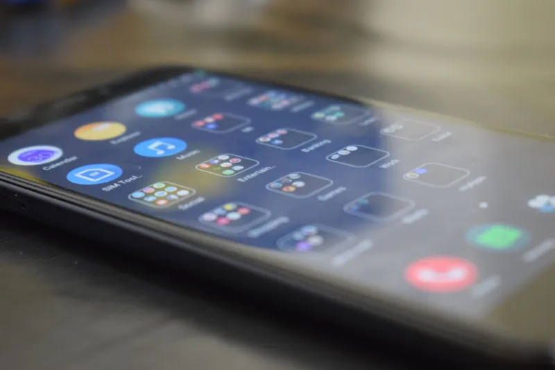
There is a button that used to be in the top-right corner of an app I still use. It did one small thing. It let me sort a list the way I wanted. Then an update arrived, the button disappeared, and my thumb kept reaching for it for months. The app was not broken. It was just missing a piece of me.
That is the strange grief of software. Nothing dies, exactly. A feature is removed, a menu is reorganized, a shortcut is deprecated, and the interface closes over the hole like water. But your body remembers. Your hand remembers. And for a while, you are haunted by a button that no longer exists.
Muscle Memory Is a Ghost
Muscle memory does not care about release notes. It cares about repetition. You opened that menu a thousand times. You learned the exact distance from the edge of the screen. You knew the icon by shape, not label. Then the designers moved it, and your thumb kept going to the old place, tapping empty space like someone knocking on a door that has been bricked over.
This is not nostalgia for old software. Old software was often worse. It was slower, uglier, less accessible. But it was yours. You had built a private map of it. Updates redraw the map without asking whether you had learned the roads.
The Communities That Archive the Old Menus
There is a whole subculture of people who keep the old interfaces alive. They screenshot them. They document them. They run emulators, preserve installers, and argue about which version was the last good one. Some of this is practical: old software still works for certain tasks. Some of it is archival: a record of how things looked before the redesign. And some of it is pure grief.
These communities are not just hoarders. They are witnesses. They know that the history of software is mostly written in changelogs, and changelogs are terrible at capturing the feel of a thing. They do not tell you that the old save button had a satisfying weight. They do not tell you that the settings panel used to fit on one screen. They do not tell you that the feature you loved was removed because it did not test well with users who had never used it.
Why Removal Feels Personal
A removed feature is a small rejection. It says: the way you worked was not important enough to keep. That is rarely the intent. Product teams remove things for budget, complexity, security, or because a metric moved in the wrong direction. But intent does not soften the blow. The interface is the place where you and the machine meet. When a familiar part of that meeting place disappears, it feels like the machine changed the terms.
This is especially true for features that were never headline material. The tiny checkbox. The secondary sort. The keyboard shortcut. The weird little export option. These are not marquee features. They are personal features. They are the ones you found yourself, the ones you built a workflow around, the ones that made the software feel like it was yours.
The Difference Between Change and Erasure
Not every removal is a crime. Some features are dangerous. Some are redundant. Some are used by twelve people and maintained by no one. Good design sometimes means cutting. But there is a difference between change and erasure. Change explains itself. Erasure pretends the old thing never mattered.
A good update says: here is what moved, here is where it went, here is why. A bad update just closes the hole and hopes you forget. The bad update is more common, because it is easier. It treats the interface as a clean slate instead of a lived space.
What We Owe the Missing Button
In 2026, our software changes faster than our habits. That is the deal we have made. But we do not have to pretend the deal is painless. We can admit that a missing button is a small personal erasure. We can archive the old menus. We can complain in the forums. We can remember that the interface is not just a product. It is a place where people spend their days.
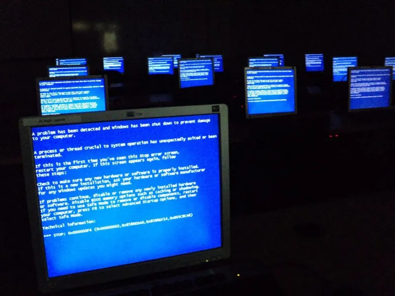
So here is to the button that used to be there. It was not important to the roadmap. It was important to someone. That is enough. The signal broke, the layout shifted, and the hole remains. We can call that a glitch. Or we can call it what it is: a tiny monument to the way we used to work.